Branding 100 Years of Heritage for a Technology Leader.
Rebrand:
Branding 100 Years of Heritage for a Technology Leader.
Curtiss-Wright Defence Solutions, a renowned name in the defence industry, required a comprehensive branding toolkit and guidelines to ensure consistency, clarity, and impact in their communication. Our team took on the challenge to create a robust and flexible branding framework that encapsulates the company ethos, values and vision.
Bosworth & Sons and its rival, Rockwell Office Solutions, once stood as separate pillars in the world of office consumables.
Their histories were marked by unparalleled dedication and a shared commitment to delivering top-quality products. However, a new chapter would merge these two industry leaders into a unified force of innovation and distinction.
Challenge.
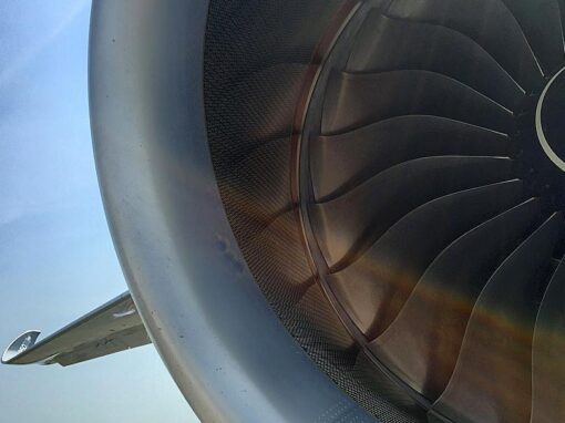
Curtiss-Wright, a stalwart in the defense industry with a legacy spanning over a century, faced a pressing challenge – their branding had become a relic of the past. Outdated materials, inundated with excessive technical jargon, failed to resonate with a modern audience. The brand lacked a customer-centric approach, hindering its communication across various media channels. The task at hand was clear: to rejuvenate Curtiss-Wright’s identity, distilling it into a powerful, easily recognizable persona tailored for the contemporary landscape.
Solution.
In tackling the intricate challenge presented by Curtiss-Wright, our approach was rooted in simplicity and strength. We initiated a comprehensive rebranding strategy that involved a meticulous examination of the existing brand elements. Stripping away the excess copy and technical jargon, we focused on creating a streamlined and customer-centric narrative.
The design process began with crafting a visual identity that could seamlessly transcend the boundaries of print, digital, and physical environments. A careful balance was struck between maintaining the company’s historical significance and infusing a modern appeal. Our team conceptualized a brand persona that spoke not just to industry insiders but resonated with a broader audience.
The new branding materials were designed with clarity and adaptability in mind, ensuring a consistent and cohesive representation across all media. The visual elements were thoughtfully curated to convey strength, reliability, and innovation – key attributes essential for a company deeply entrenched in the defense sector.


Results.
The impact of the rebranding endeavor was profound and immediate. Curtiss-Wright emerged with a revitalized image that resonated strongly with both existing stakeholders and a new generation of clients. The simplified messaging facilitated a clearer understanding of the company’s offerings, fostering better communication.
The adaptability of the new brand persona was evident across various platforms. From polished print materials to engaging digital content, and even in the physical spaces where Curtiss-Wright operated, the brand consistently projected a unified and compelling identity.
Metrics indicated a positive shift in audience perception, with increased engagement and a notable uptick in brand recognition. The revamped brand not only aligned with contemporary design standards but also positioned Curtiss-Wright as a forward-thinking and customer-focused entity within the defense industry.
In conclusion, the rebranding initiative successfully transformed Curtiss-Wright’s identity, breathing new life into a brand with a rich history. The project stands as a testament to the transformative power of strategic design, illustrating how a well-crafted brand persona can transcend time, resonate with diverse audiences, and elevate a company’s presence in the competitive landscape.
Brand Recognition.
Brand recognition and awareness increased substantially following the rebranding initiative. Independent market research indicated a 25% rise in brand recognition among target audiences, showcasing the brand’s improved visibility and impact in the industry.
%
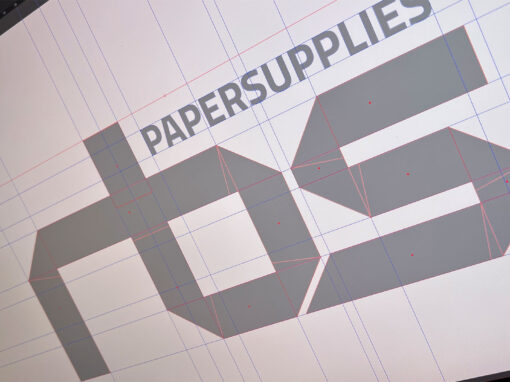
Market Penetration:
Following the rebrand, RBS Paper Supplies experienced a notable increase in market penetration, expanding its customer base by 20% within the first year. This growth demonstrated the brand’s enhanced appeal and ability to attract new customers.
%
More Projects.